I chose Out of Place because I am fairly confident in using photoshop and I think that I can create surrealist images. I have also explored different photographs related to the them and it really interests me. By choosing this theme I will be able to strengthen and expand my ability and knowledge of this theme to create images that provoke mystery and surrealism.
My first thoughts on this theme is that it is very popular to put things in places where they don't belong. It is also difficult to understand how and why this images were made. I think I will try and explore the concept of surrealism.
Researching other photographers
Tommy Ingberg
|
|
|
Tommy Ingberg is a photographer and visual artist, born 1980 in Sweden. He works with photography and digital image editing, creating minimalistic and self-reflecting surreal photo montages dealing with human nature, feelings and thoughts.
Tommy leaves the interpretation of his work up to the viewer but says, "For me, surrealism is about trying to explain something abstract like a feeling or a thought, expressing the subconscious with a picture. For my work I use my own inner life, thoughts and feelings as seeds to my pictures. In that sense the work is very personal, almost like a visual diary. Despite this subjectiveness in the process I hope that the work can engage the viewer in her or his own terms. I want the viewers to produce their own questions and answers when looking at the pictures, my own interpretations are really irrelevant in this context. "
Tommy leaves the interpretation of his work up to the viewer but says, "For me, surrealism is about trying to explain something abstract like a feeling or a thought, expressing the subconscious with a picture. For my work I use my own inner life, thoughts and feelings as seeds to my pictures. In that sense the work is very personal, almost like a visual diary. Despite this subjectiveness in the process I hope that the work can engage the viewer in her or his own terms. I want the viewers to produce their own questions and answers when looking at the pictures, my own interpretations are really irrelevant in this context. "
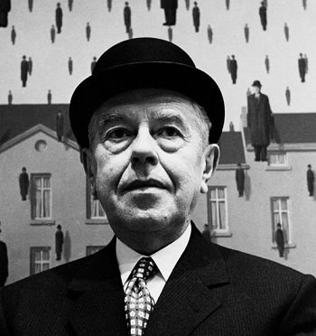
Rene Magritte
|
|
Rene Magritte was an internationally acclaimed surrealist artist of all time, yet it was not until his 50s, when he was finally able to reach some form of fame and recognition for his work. Rene Magritte described his paintings saying, "My painting is visible images which conceal nothing; they evoke mystery and, indeed, when one sees one of my pictures, one asks oneself this simple question, 'What does that mean?' It does not mean anything, because mystery means nothing, it is unknowable."
|
Evaluation:
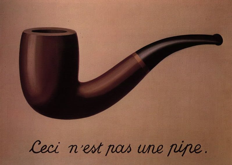
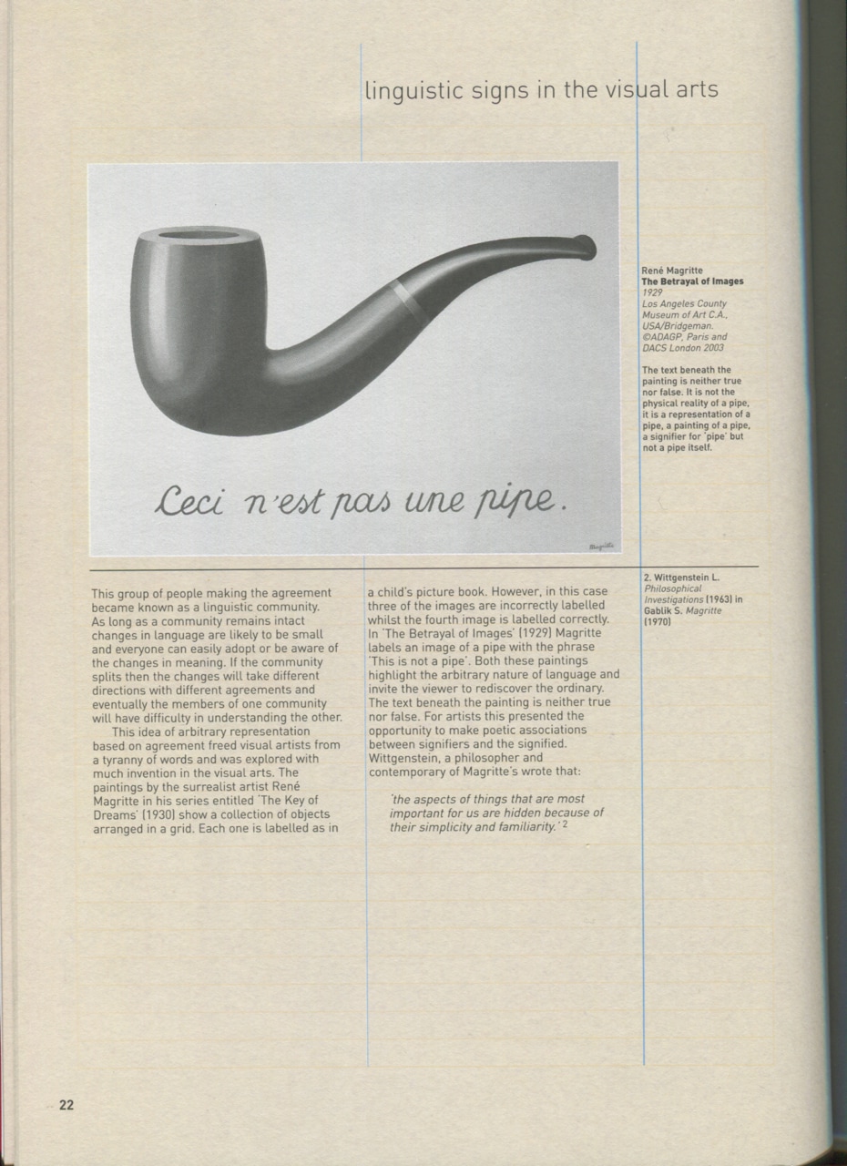
This may be by far one of Magritte's most famous paintings because it plays with the idea of photography and paintings being an illusion. The French translates to "This is not a pipe" in english, and this changed art because it made people think very deeply about it, including myself. This is significant because it's true, it is in fact not a pipe. It's a mirage, an illusion. In reality it's a painting, not a pipe, but our brain makes us believe it is a pipe because it looks like one yet we can not physically touch it or hold it. |
More Research
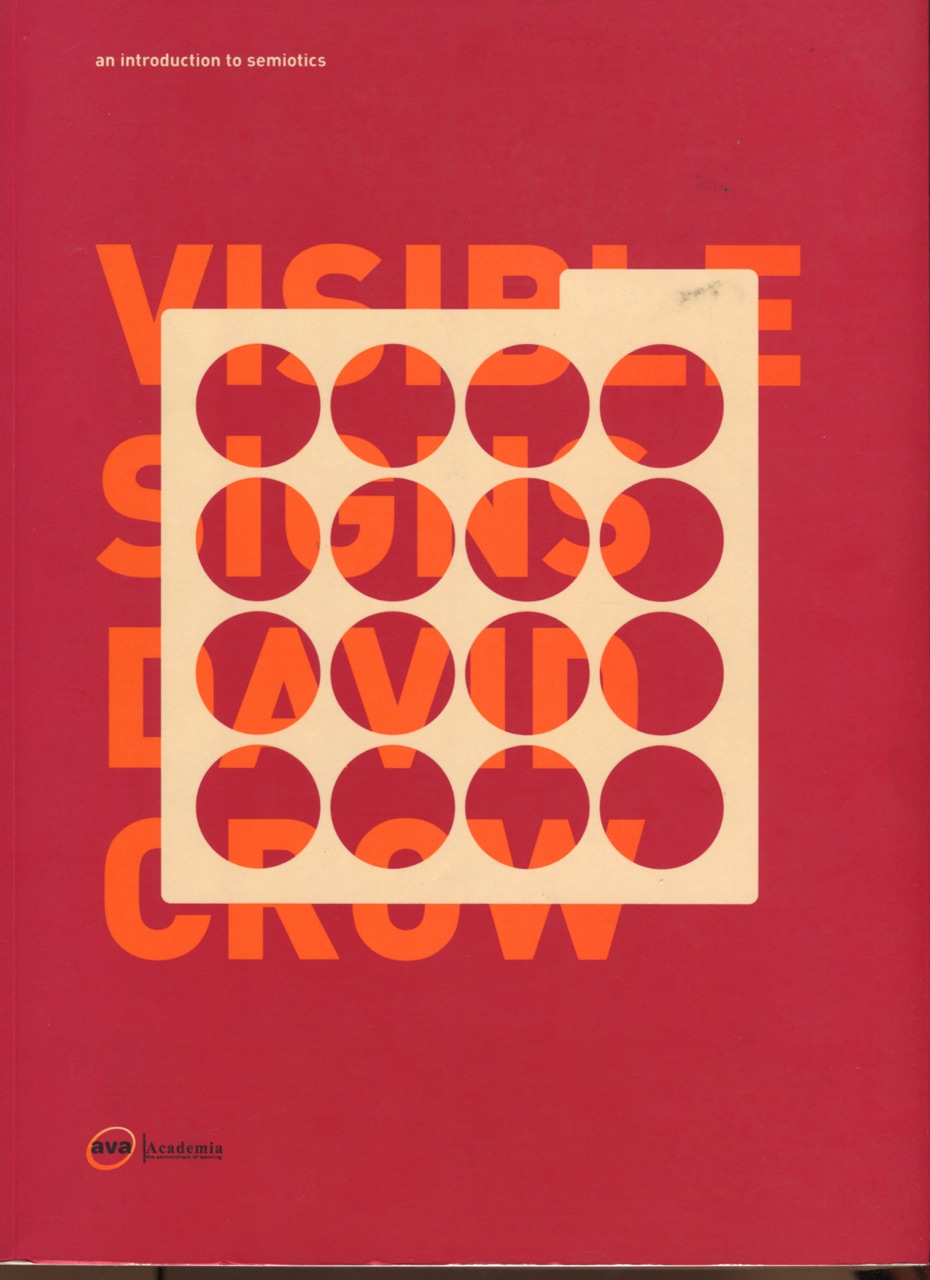
I took a look in a book called "Visible Signs" by David Crow. The aim of the book is to "explore the mechanics of visual language in an attempt to help you understand how visual communication works." the book also explores the "study of language (linguistics) and the science of signs (semiotics).". This has been a great help to me because it helped me to grasp the idea of semiotics which is what I plan to carry out as my first experiment and final piece. I scanned the pages that were relevant to my topic.

My response
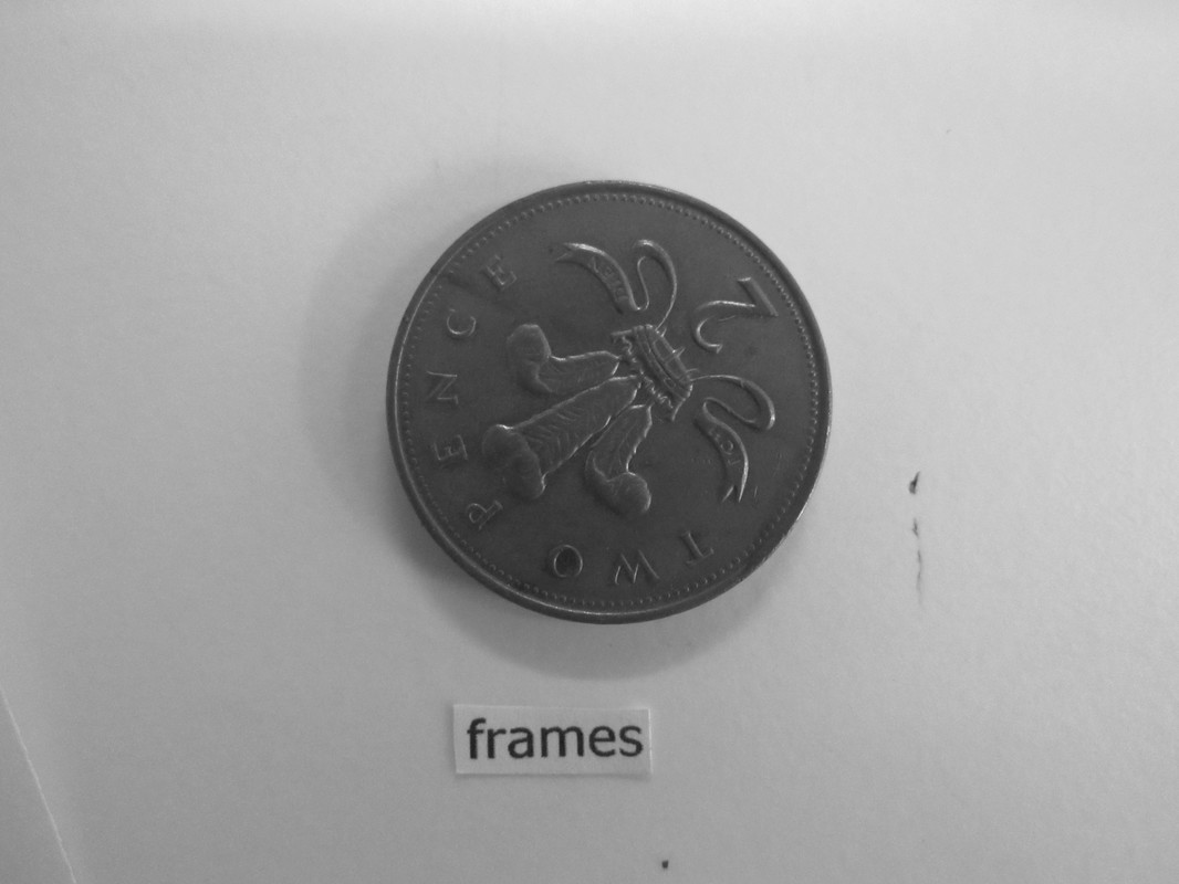
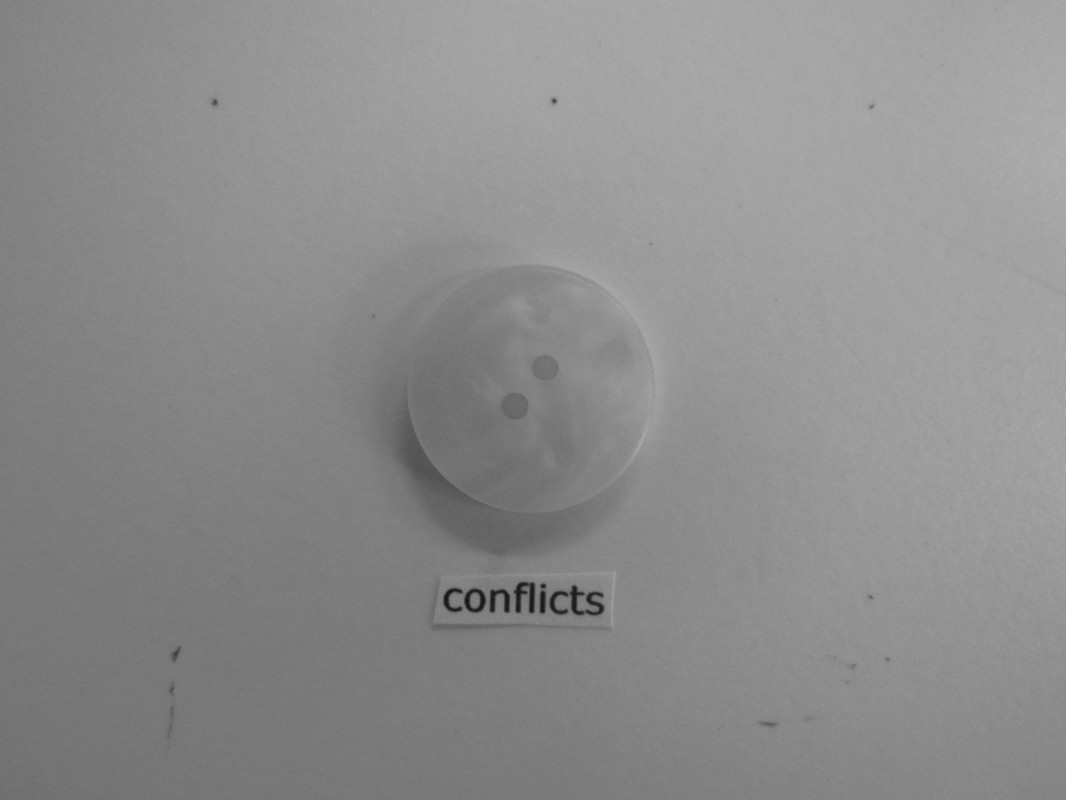
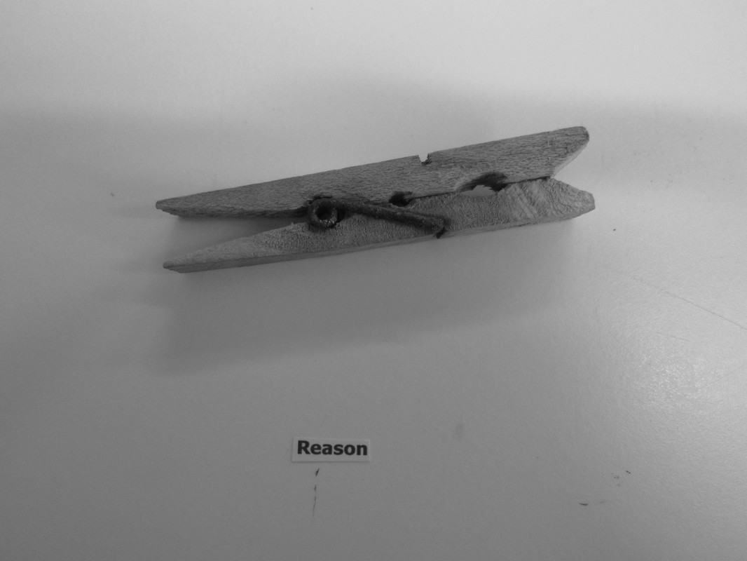
I found some random and simple objects from the darkroom and found a sheet of scrap paper so that I could cut out some random words to use. I made sure the words were completely irrelevant to the object so that the viewer had to think about the meaning and how they relate to each other. I took inspiration from Rene Magritte to create these images. If I were to develop these images further I would play around with the lighting, background, rotation, colour and more.
Refining and Developing

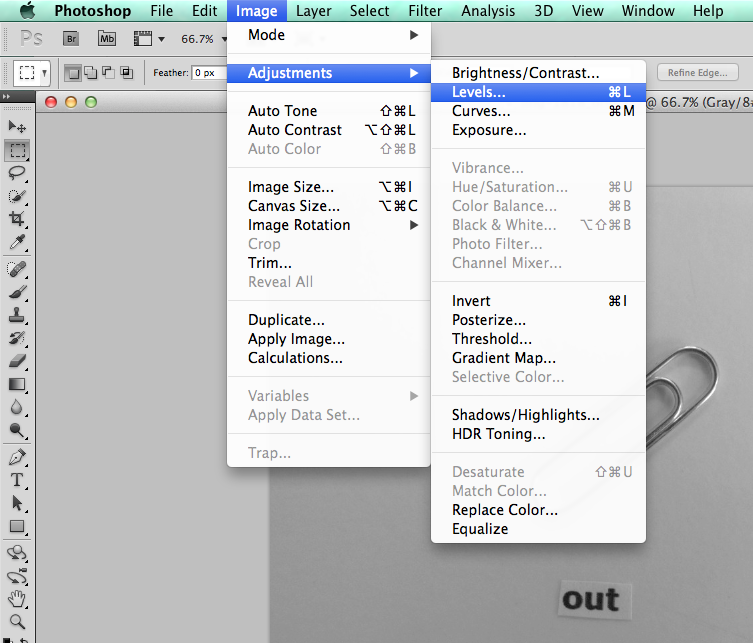
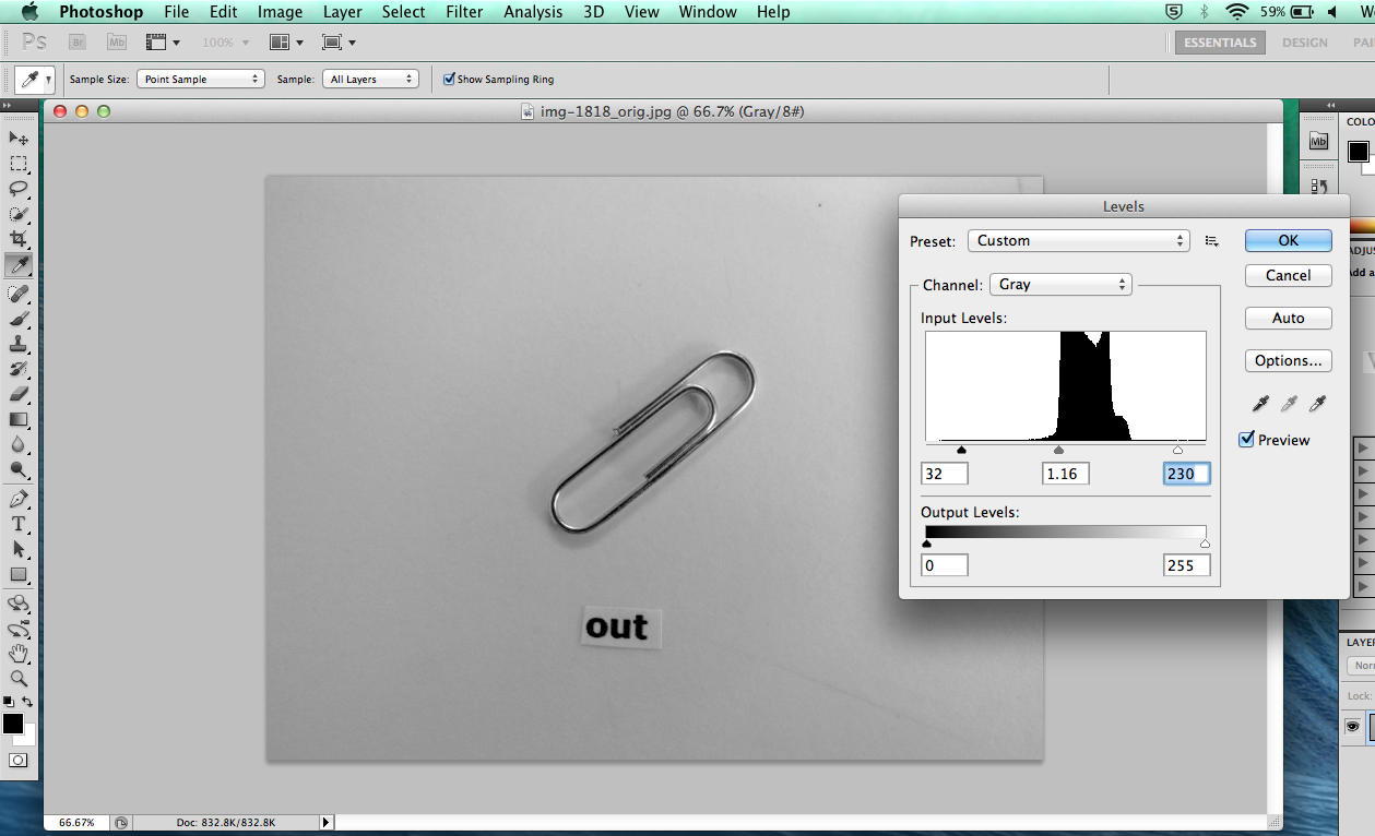
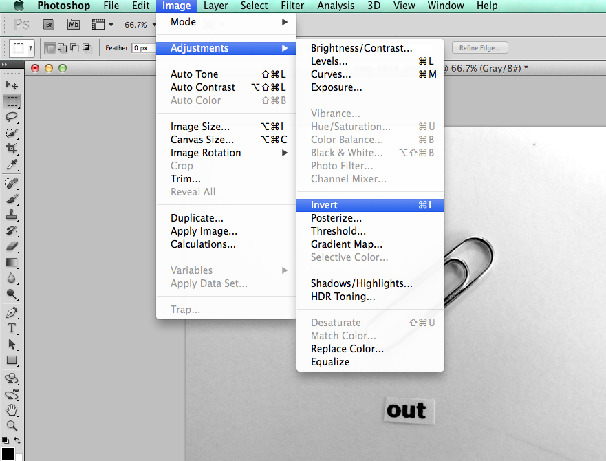
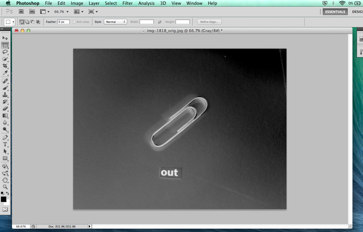
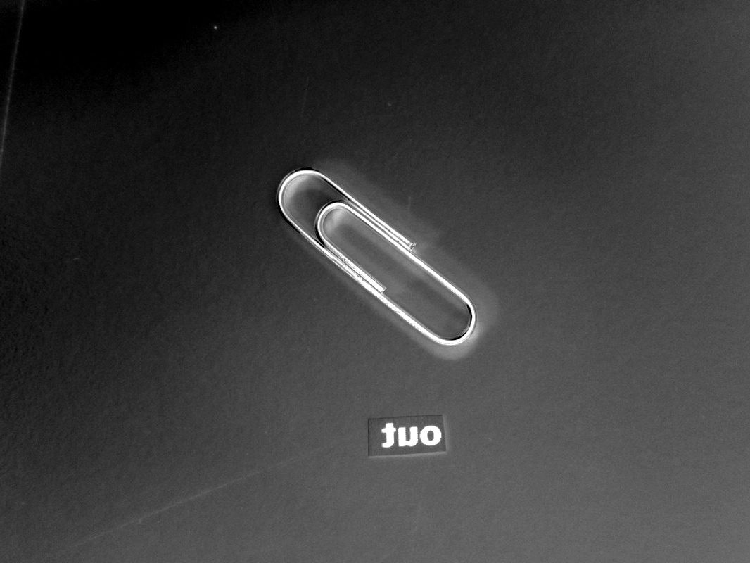
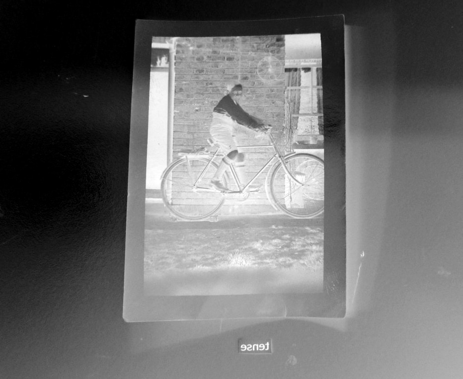
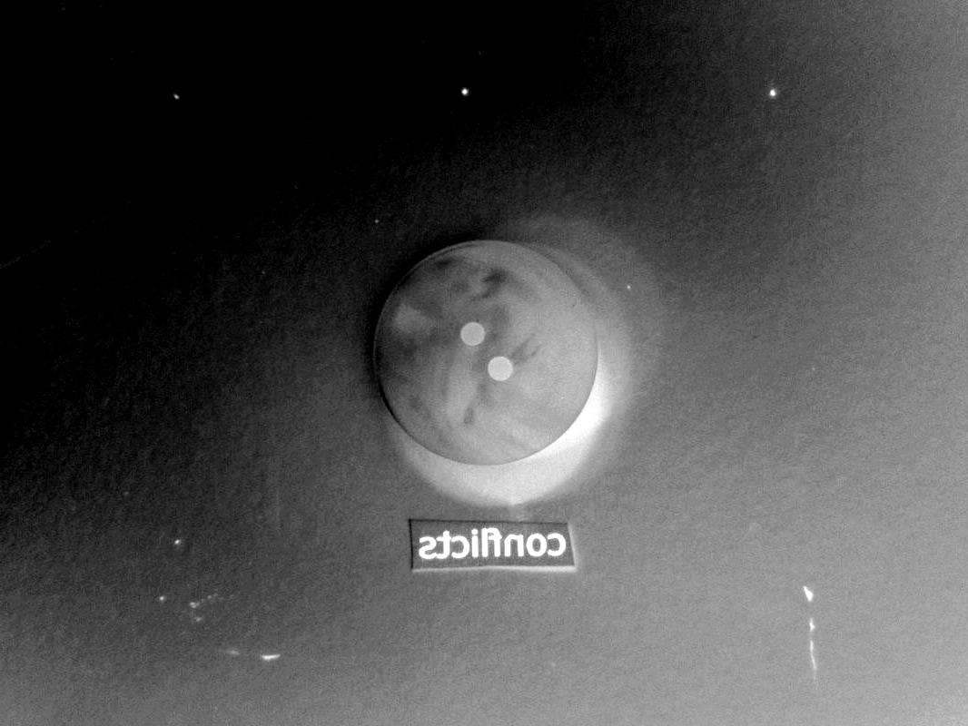
To refine and develop my images I started by putting them on photoshop and adjusted the contrast of the images to make the dark areas darker and the light areas lighter. I then inverted the colours and flipped the image horizontally to make the image even more out of place.
The Inverted Response


What I next plan to do is take them to the darkroom and revert them back to their original form through the normal process of photograms. If this goes right then it will look like the original image but is actually the reverse of a reversed image through different processes.
Getting it right
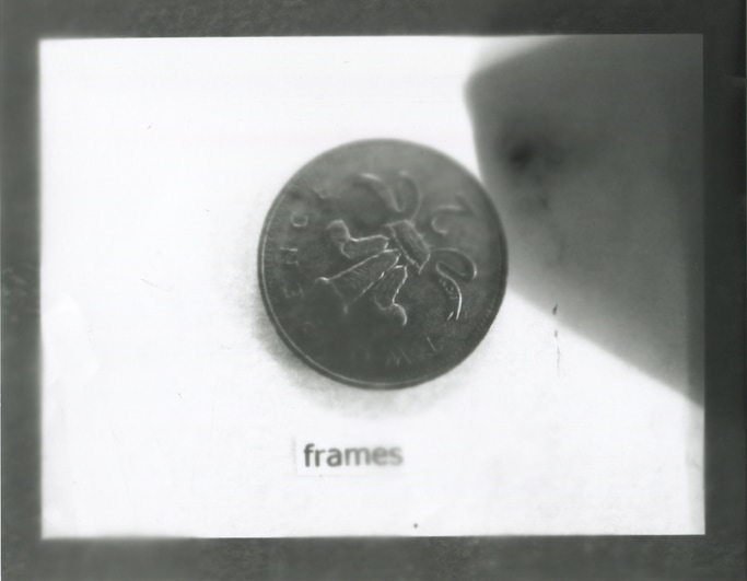
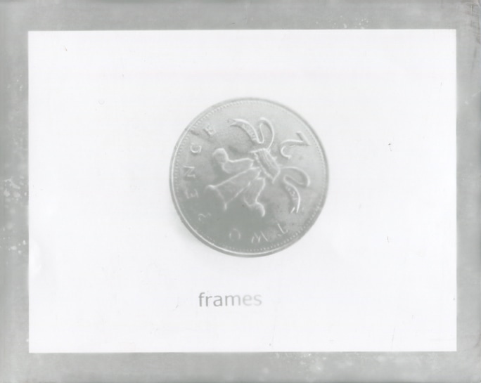
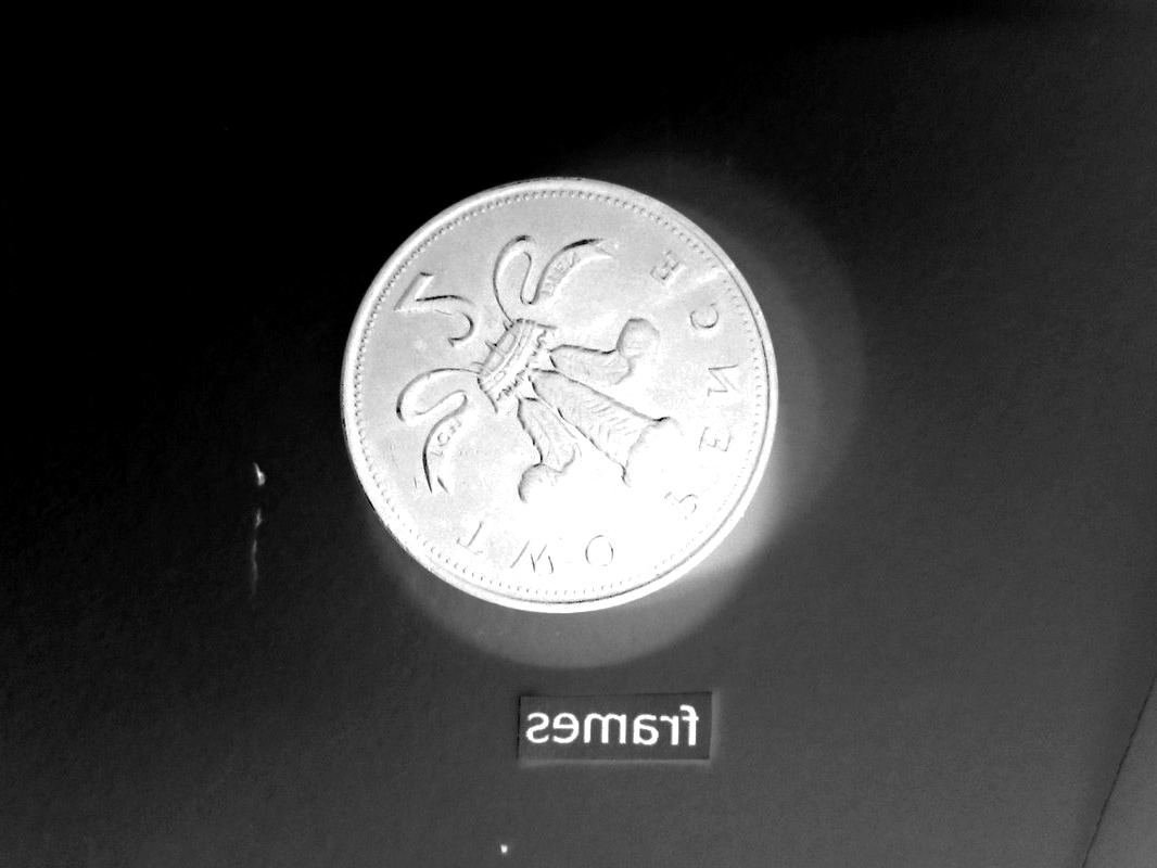
The first time I did it (left) the light must have been distorted or there was something blocking the light from getting through to the photographic paper which made a section of the image black which is no good. The second time I tried to do it (middle) it was for too pale and unclear to use because it wasn't exposed to the light for long enough. Finally I got it right (right) and it is clear enough to use, I left it exposed to the light for a little while longer which was just a few seconds.

I think they all came out pretty well and they're clear and visible enough to use in my final piece. I really think its amazing how using the darkroom I was able to reverse the effects that I made in photoshop and it still looks like nothing changed apart from the black borders around the image. My favourite is the first one because I think it came out the best and it's the clearest as well as the word being slightly un-centred which just contributes to it being out of place.
Arranging the Images
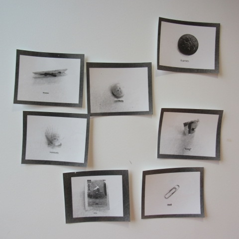
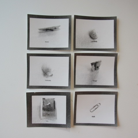
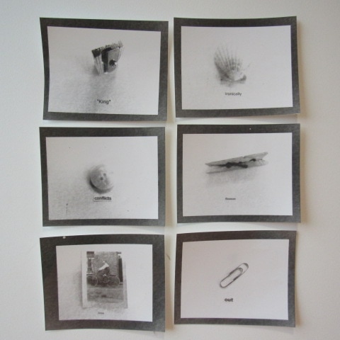
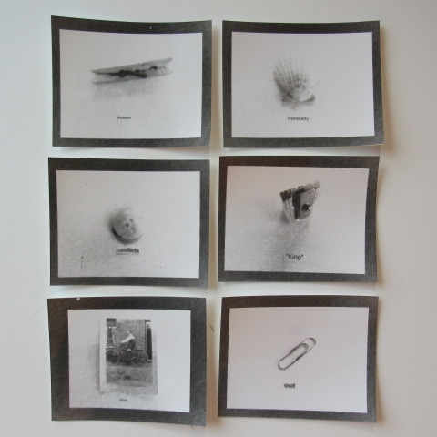
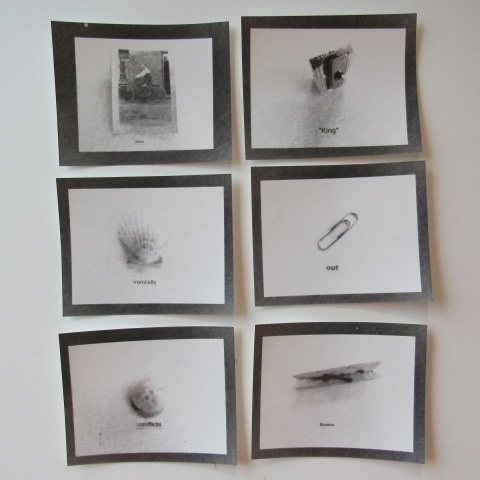
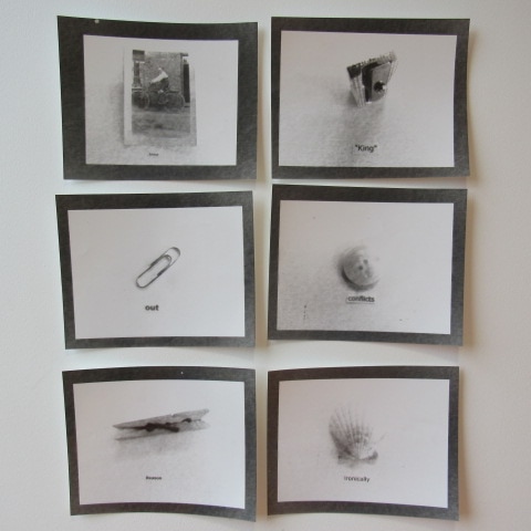
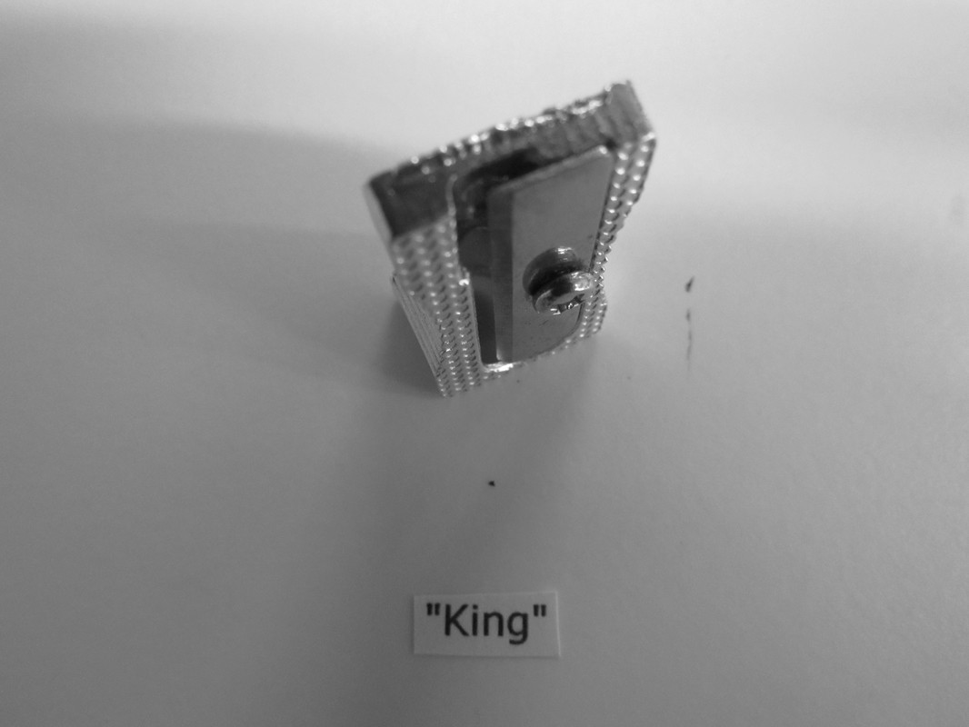
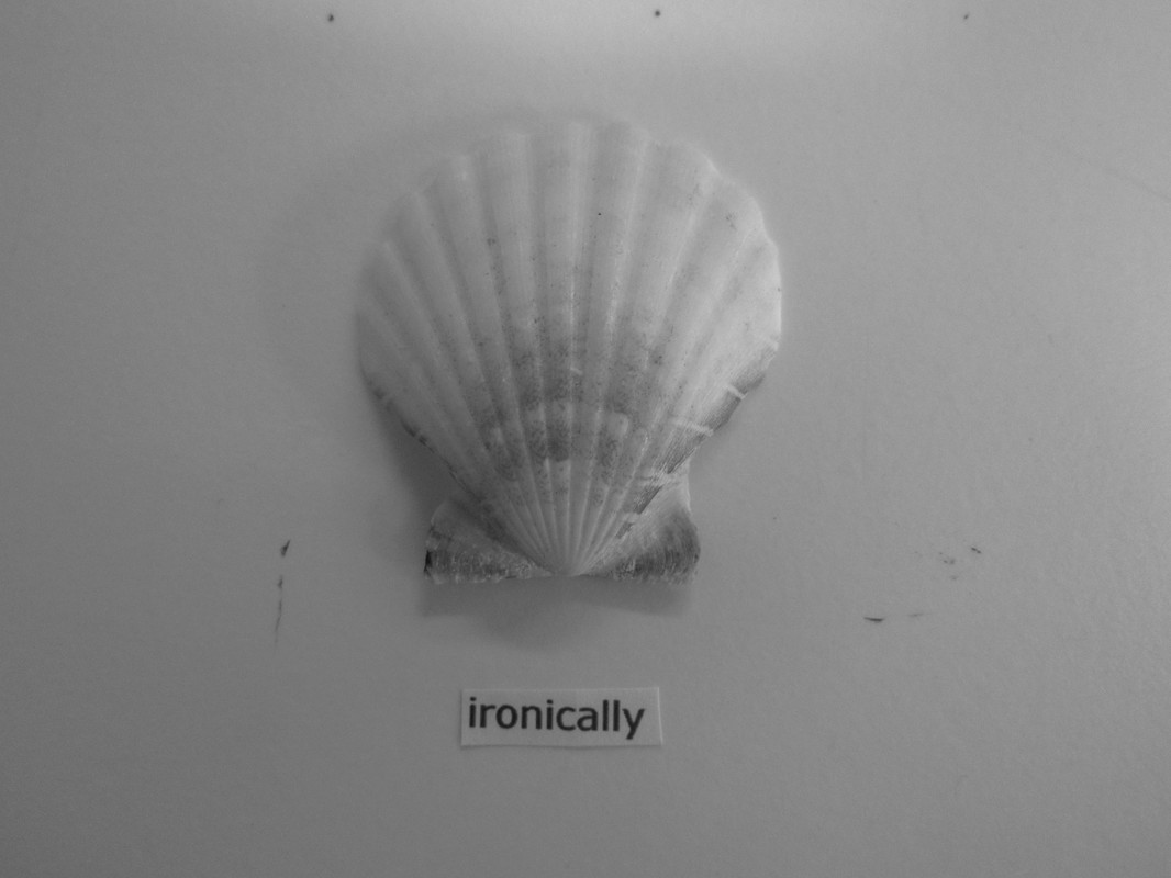
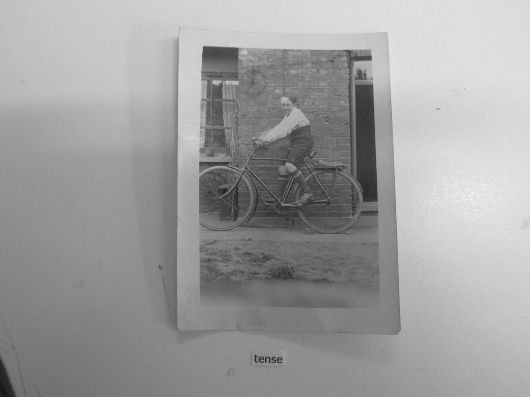
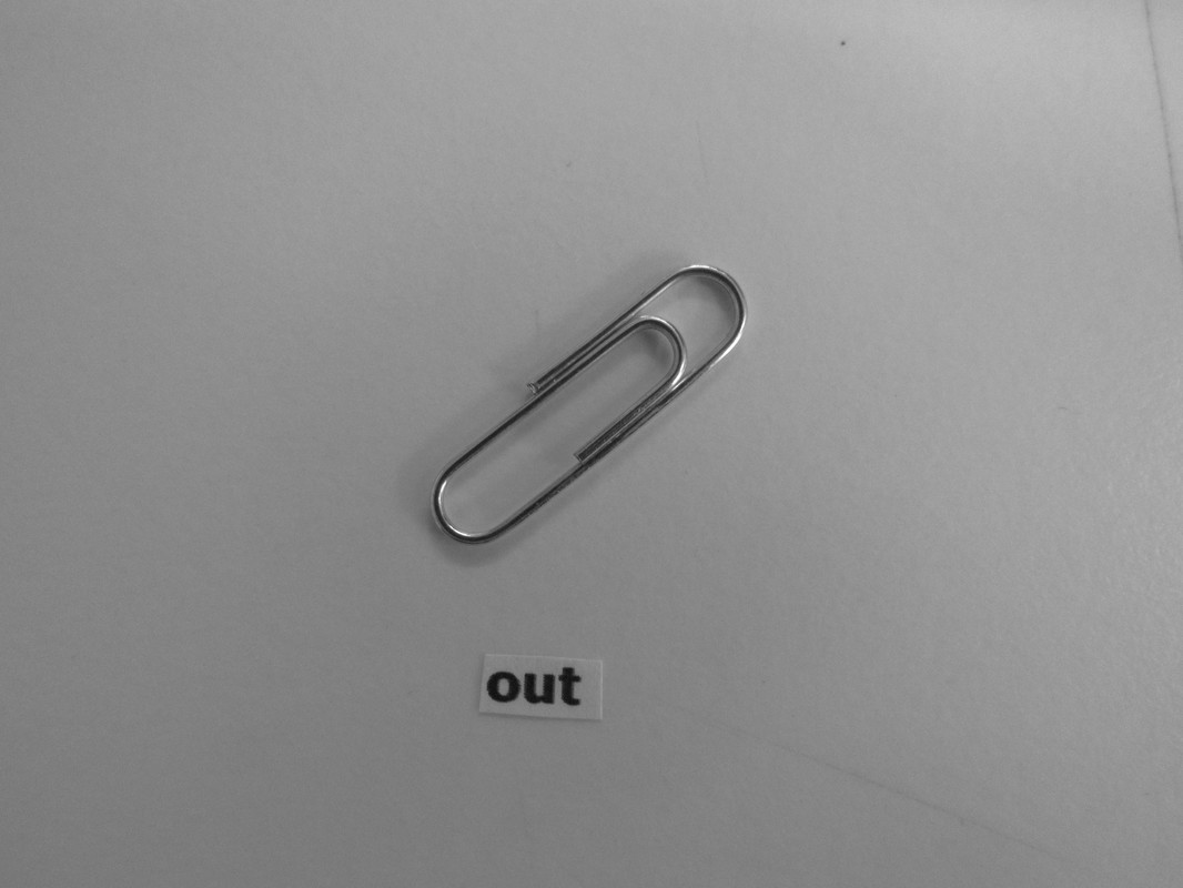
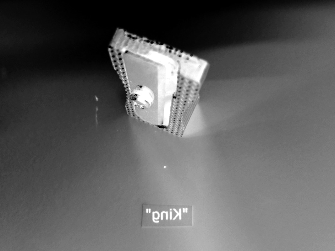
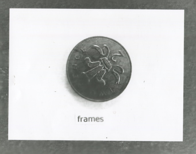
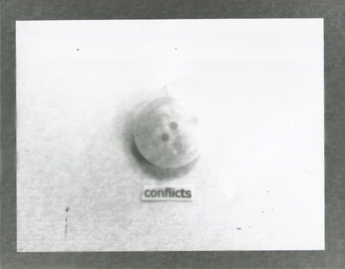
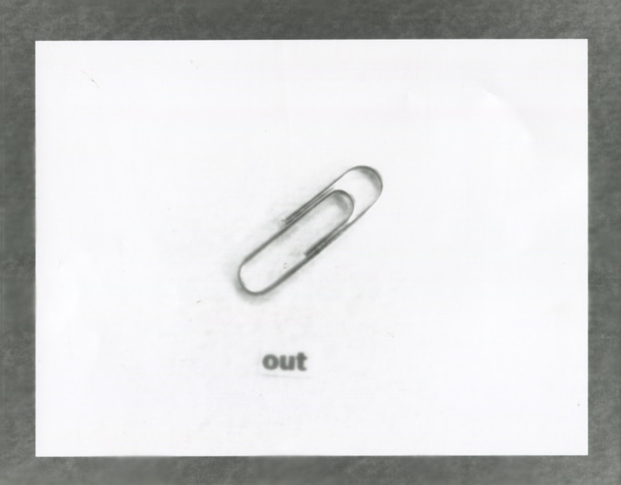
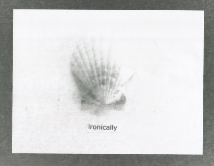
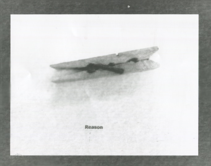
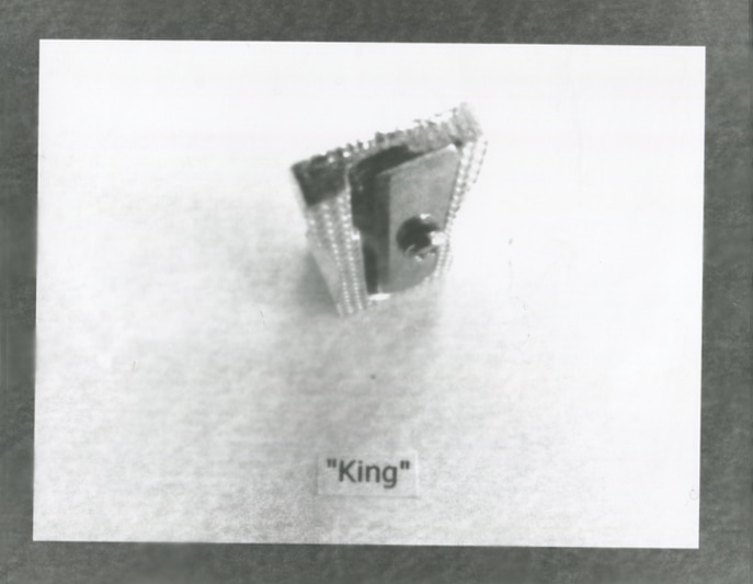
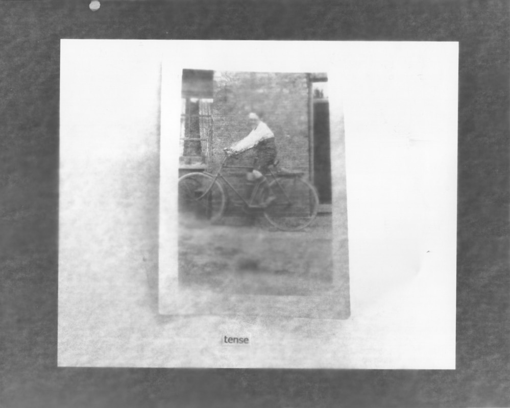
Here is my thought process when trying to order the images. There were seven in total so if I wanted to make them align then one would have to be left out. I took into account the words and how I could make a coherent sentence or phrase out of the words. Bearing this in mind I managed to make a series of out of place photographs with the sentence "tense "King" out conflicts reason ironically". Again the sentence does not relate to the images but that just adds to the theme of out of place more.

First Final Outcome
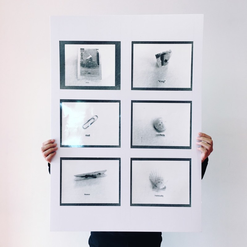
I finally decided on "Tense "king" out conflicts reason ironically". The sentence has nothing to do with the images or why I decided the images but they do relate to the theme because it is out of place along with everything else. So what was once a simple photograph of two simple things that had no correlation to each other, became a photogram of two things that had no correlation to each other with a long process. This final piece is a good example of semiotics because it takes two different signs which are the words and the objects and put them together. It mixes up the referents in your mind because the word out and the paper clip do not match. People tend to believe that what they see is 100% true, but its not. This is a problem that some photographers try to address, that photography clouds our judgement with what is reality and what is an illusion.
Comparing Images
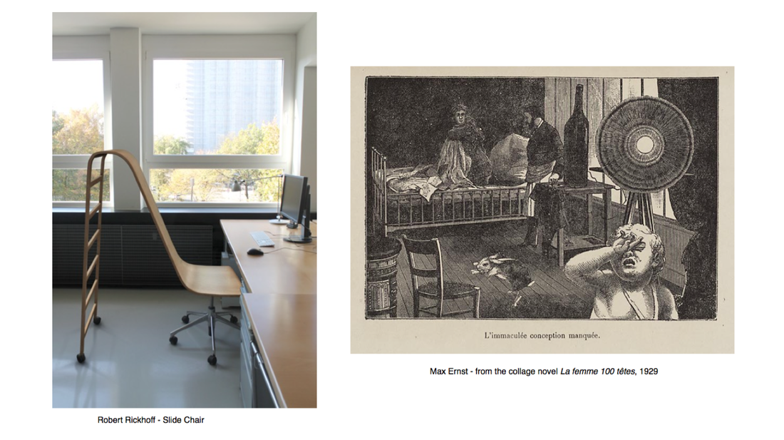
In both photographs there are elements of uncertainty and mystery. Richoff's photograph shows a "slide chair" with wheels that looks oddly ordinary for some reason. In the photograph there are also big open windows which trees and the scaffolding or balconies of a building behind. When I see this photograph I think of the words innovative, simple, calm, light , natural and yet unnatural. The painting by Ernst shows a single image with a series of events. There is a crying toddler in the bottom right hand corner of the painting, what appears to be a rabbit jumping on a chair, a large circular object on a three legged stand, a very large glass bottle on a table, a woman covering herself up from a man, all of these are very peculiar in their own way. I also noticed that everything is placed around randomly almost as a collage, and I think this is because Ernst didn't want the viewer to focus on just one thing.
Rickhoff's photograph seems to be spaced so that the slide chair is in the centre of the of the image and that it is the centre of focus. I also had the idea of natural versus man made, the slide chair is clearly man made and seems to act as a transition from playful childhood to hard working adulthood. behind the windows there are natural trees and behind them there is a building being made which is also man made. Whether Rickhoff intended it to be that, I don't know, but that is my interpretation.
What I find most interesting about Ernst's painting is the giant glass bottle that is thereon the table. It is so out of place that it cannot possibly be real. None of it seems real. Such odd scenarios all at once. This strengthens my idea that this could be a collage because it would make sense and adds to how out of place it really is. I think it is very convincing and looks almost real even though it is not, and its good at that. Rickhoff's slide chair isn't real either. It can't be. I believe that it is just some clever photoshop work. But the fact that he thought of every little detail to perfect it and since it looks like a photograph our minds instantly believe that it is real and physically there, but its not, its simply just an illusion.
Both are very good examples at how art and especially photography can play tricks with our minds and make us question what is real and what is not.
2nd Idea
For my second idea I am planning to be more physical. I am going to revisit the art of collages by cutting out someone or something and placing something behind whilst relating it the theme of out of place.
|
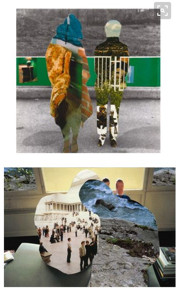
I got the idea to make these kinds of collages from a post on Pinterest which caught my attention because I thought it was related to out of place. It interests me how scenes that don't fit together fit so well and looks like it belongs where it shouldn't. Collages are an old art technique that brings together different forms to create a new whole form that can be related or quite the opposite.
|
Research
John Stezaker
|
|
I like to think of John as a subtle surrealist because of his work. I don't really see his work as collages but I guess they are in a way because of how he takes two different photographs or sometimes the same photograph and uses it to distort a picture of a man or a woman, but usually both. John links my theme of out of place with surrealism and collages which is good because hopefully I will learn how to do the same to create an interesting and thought provoking final piece.
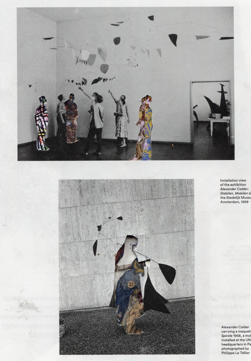
Hannah Höch
|
|
Hannah Höch inspired me and gave me ideas on how to go around making my collages. I think her collages are the closest to what I would like mine to look like. In addition to this her work is a very good example of my theme which is out of place so thats why I believe it would be smart to follow her work and find myself through it to create my own identity when making a collage. Hannah was a German Dada artist who made "photomontages" out of photographs, the press, and other media.
The start of the process

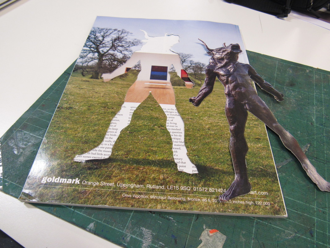
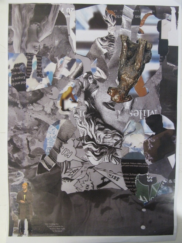
I cut out different objects and people out of a magazine much like Hannah Höch because she made her collages or "photomontages" out of photographs, the press and other media. I cut them out so that there is an empty outline that I can fill with other miscellaneous things for the background. From this I hope that the collage comes out as an out of place piece that captures the viewers interest. I realised it is much harder to cut bits out of paper with a scalpel then it looks but I think that I managed to do it well.
First attempt


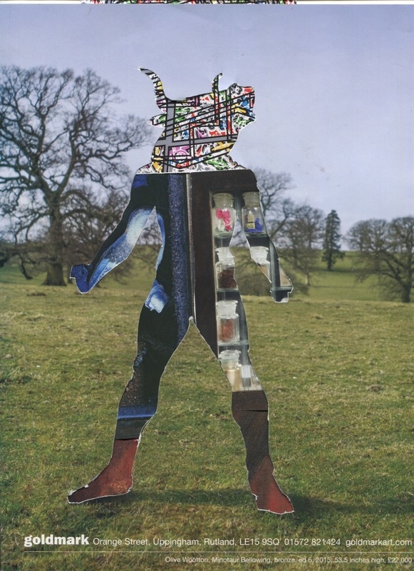


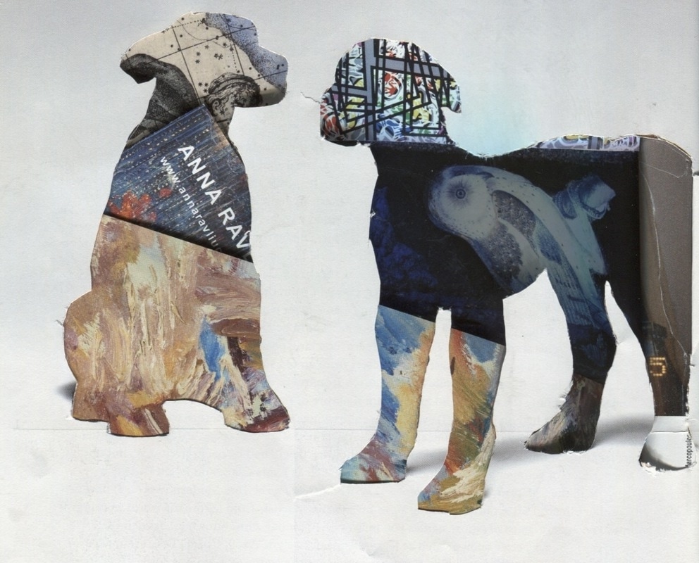
I think these came out quite well and out of place. It's out of place because I took different images from different magazines and put them together to create an eye catching image. I did this by scanning the collages I made by either organising or randomly scattering the cut outs around the pages. It really interests me how easy it is to identify what was there even though it is filled with something completely different.
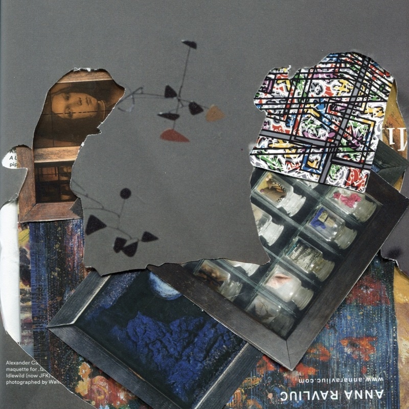
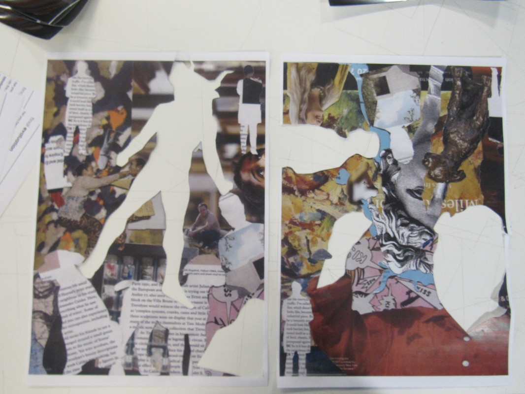
Using the extra cut outs.


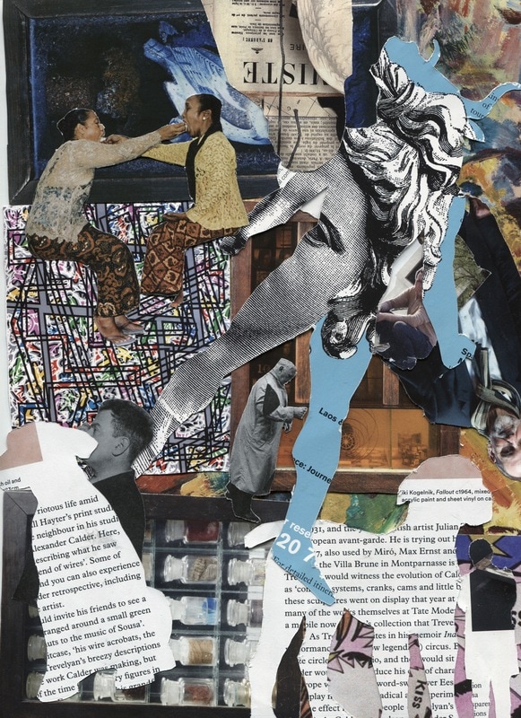
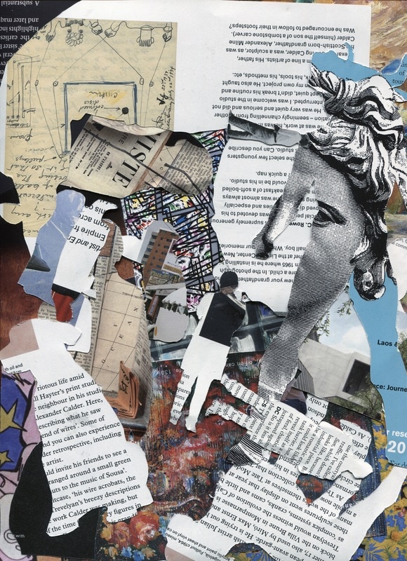

I decided to use the pieces that I cut out of the pages from the magazines and use them to make a different collage which is much more cluttered than the others. These were mainly just experiments so I had no intention of developing them any further. However, the more I look at them the more they grow on me so I might just use them for my final piece.
|
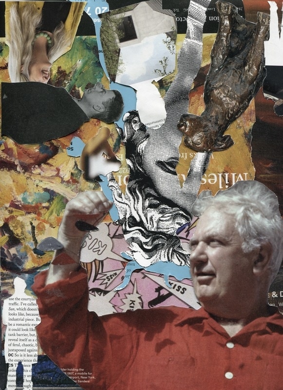
I really like this one and I think I am going to print this out on A3 paper so that I can continue to make a physical collage on top of the printed collage. I like how the man in the corner is the biggest form there and with his red shirt he is the first thing to catch your attention. You can then work your way around the piece, taking in all the random pieces and trying to make sense of them.
|
Photoshopping the Collages
|
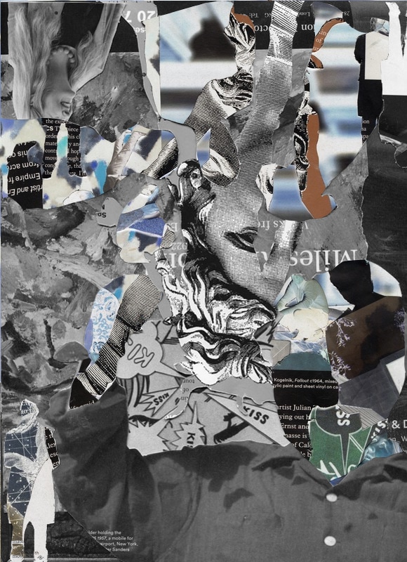
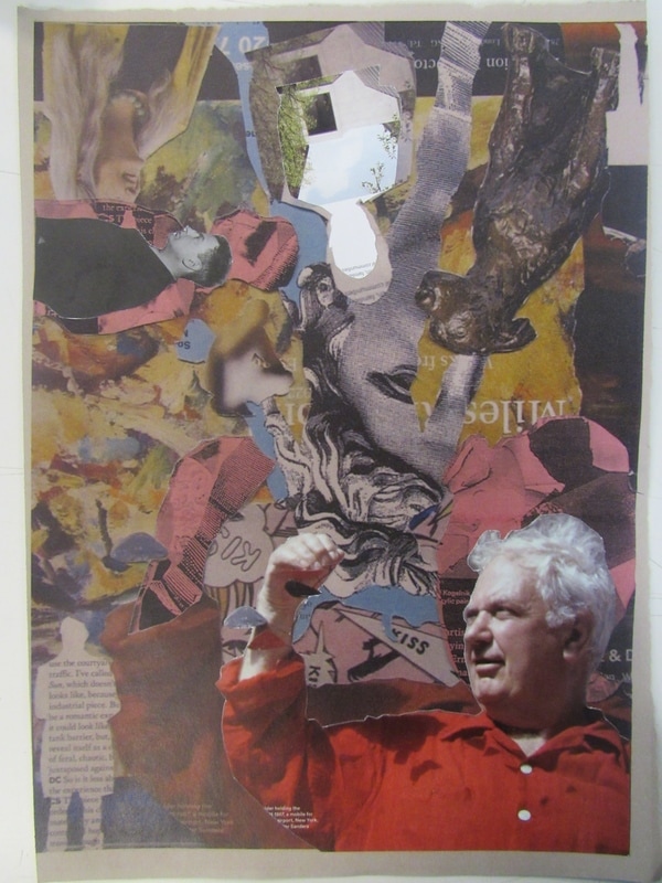
I took two of my favourite ones to photoshop and layered them. I made inverted the colours for the background collage and made the foreground black and white. I then used the magnetic lasso tool to cut out some of the forms in the foreground to reveal the inverted background. Next I flattened the layers so that it was one single layer, this way I will be able to print it and use it as the physical background for my potential final piece.
|
Further Developing and Refining
|
|
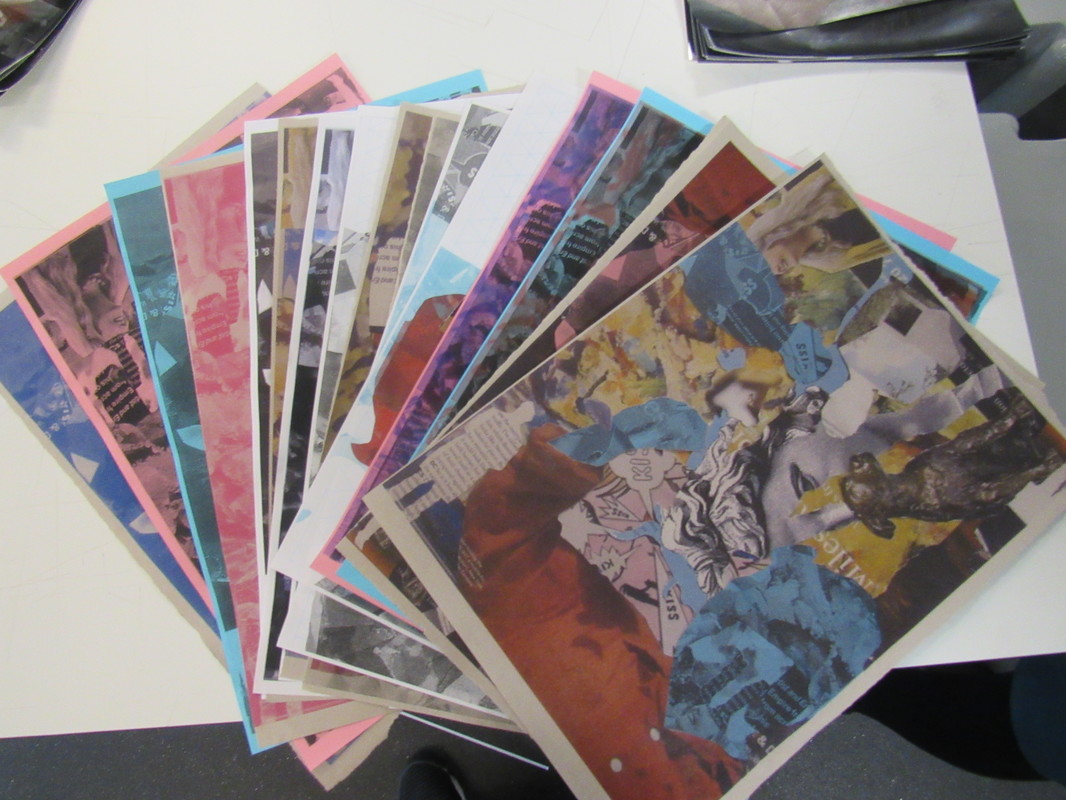
I made multiple experiments using the photocopier and the A3 cut outs. I layered them in the photocopier using regular paper, sugar paper and grid paper as well as changing the colours to blue, red, and pink. I really like some of these because it's not difficult nor easy to understand what is what. Some of these even look like pop art from the 60's or art from a comic.
Final Outcomes (Unmounted)
Final Evaluation
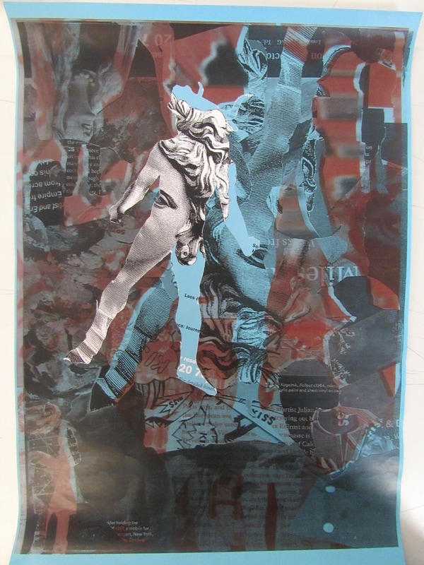
These are the three collages that I am going to use for my final outcome. I chose these three because they show the process but are also different in their own way. To fully complete these I physically stuck on some of the other cut outs back on to the A3 pieces so that it makes it really pop out and feel real. The piece on the bottom reminds me of a page from a comic or pop art from the 60's because of the vibrant colours and actions. I decided last minute to stick the cut outs back onto the piece and I arranged them onto the areas where they originally were to make them look more outstanding and real. The image on the top is interesting because of the contrasting colours which is blue and red, two opposites brought together along with all the other cut outs. The red and blue also remind me of old 3D glasses. The red even looks like blood smudged against the blue and if you look at it long enough then you can almost see the flag of Great Britain. The piece in the middle is from what I made in photoshop with the black and white foreground along with the inverted background. I thought this made an interesting contrast. It's hard to explain how this is out of place without pointing out the obvious. So I am going to make it simple. This is personal and meaningful to me because I was able to take two simple magazines that one would merely glance over and convert them into a colourful and out of place collage that captures the eye. These pieces aren't just bits of A3 paper with more bits of paper inside, flattened and 2D yet with depth. Looking back at the process I think it's amazing how I managed to make so much out of so little. I am satisfied with the progress I have made in this unit despite the slow start but I feel like I buckled down and picked up the pace. I hope the hard work I put in during these 10 hours was worth it.
